
Having a strong landing page can make the difference between a 2% conversion rate and an 8% conversion rate. It can make the difference between a lack of results and sustained lead generation.
Don’t believe me?
You can generate business without them, but you’ll get more with them.
What makes a good landing page? What are the elements to a page that that can not only generate more leads but generate more leads with the same budget — cutting your cost per acquisition and increasing the profitability of your marketing?
In this article, I’ll share my approach to (click on the link to jump to each section):
- Providing the page with a strong backbone that addresses the visitor’s questions.
- Answering the why.
- Using social proof to back up your claims.
- Optimizing the landing page for mobile.
- Using stock photography the right way.
- Building a strong opening message (possibly the most important!).
A Starting Formula
There is no magic or timeless formula for a successful landing page, but I have found one that has consistently brought our clients success. I think of it as a strong backbone, a support for the other independent elements that together can make a spectacular asset for your traffic generating marketing.
At the highest level, this core backbone answers four questions: what, how, who, and why. Each of these, except the why, are distinct elements, with ‘why someone should choose you’ being the element that binds the entire page together.
Pen to paper, these elements will look like this:
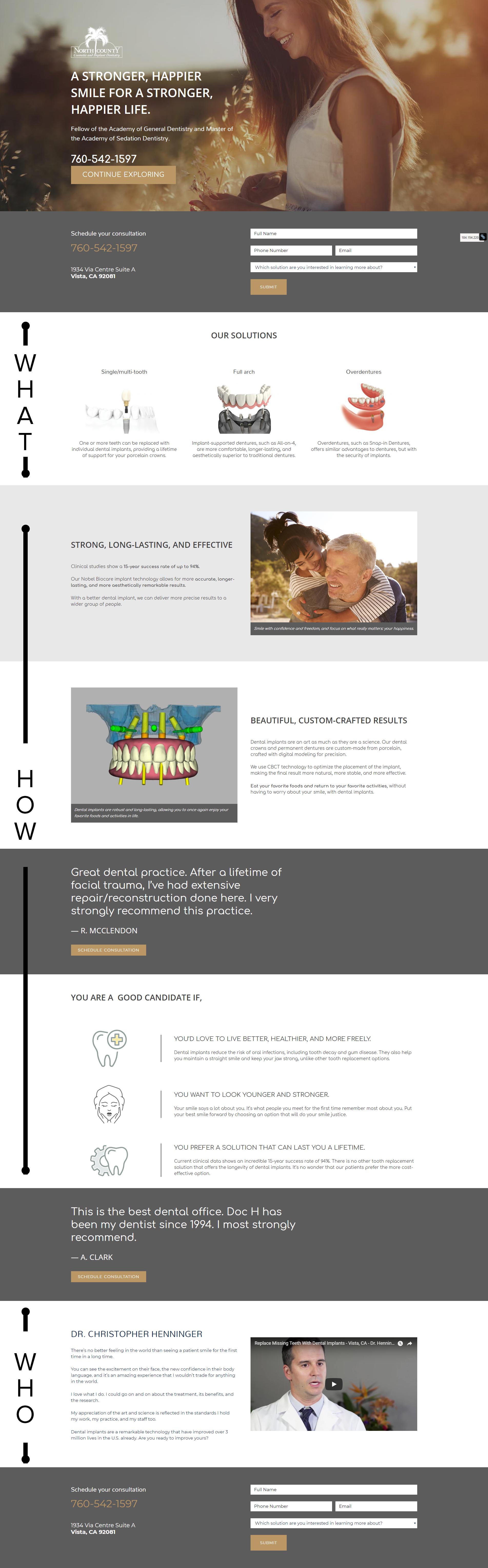
Remember that the landing page is a sales pitch, and every sales pitch has a reason behind the order of its words. Every sales pitch builds on itself to reach a climax where the opportunity is closed or lost. And every sales pitch answers what it is you’re buying, how this product or service works, and why you should buy it from me.
These elements can be arranged in different ways and they can be more or less complex. This isn’t a formula, it’s a spine, a backbone that provides the core of the landing page structure.
Here is an older landing page that answers all the key questions, but in a different order and with an additional layer of pre-qualification elements.
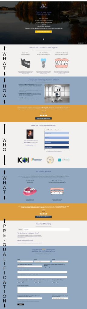
Notice how in both examples I don’t have a specific section answering the ‘why’ question? The ‘why’ should inform all of it. Everything should speak to why they should choose you. If you think of the ‘why’ as your philosophy, the traits that define you as a person and as a business, then this philosophy should imbue all of your marketing assets from start to finish, and your landing page is no different.
To recap, no matter the complexity of the sales tactic and abstracting from the order in which you answer them, your landing pages must answer those four questions:
- What it is I’m selling
- How it is that this product or service will help you
- Who it is that’s selling to you
- Why you should buy it from me
Answering the Why
When you come across a good salesperson, how do you know? Is there a section of their pitch where they say, “Hey, I’m honest, trust me?” Or is it a feeling you get throughout the conversation, as they answer questions or through the tone of your voice? In my experience, it’s always been the latter.
I identify with the person. They hold characteristics that form my opinion of them. And I can trust the person, I can trust what they say.
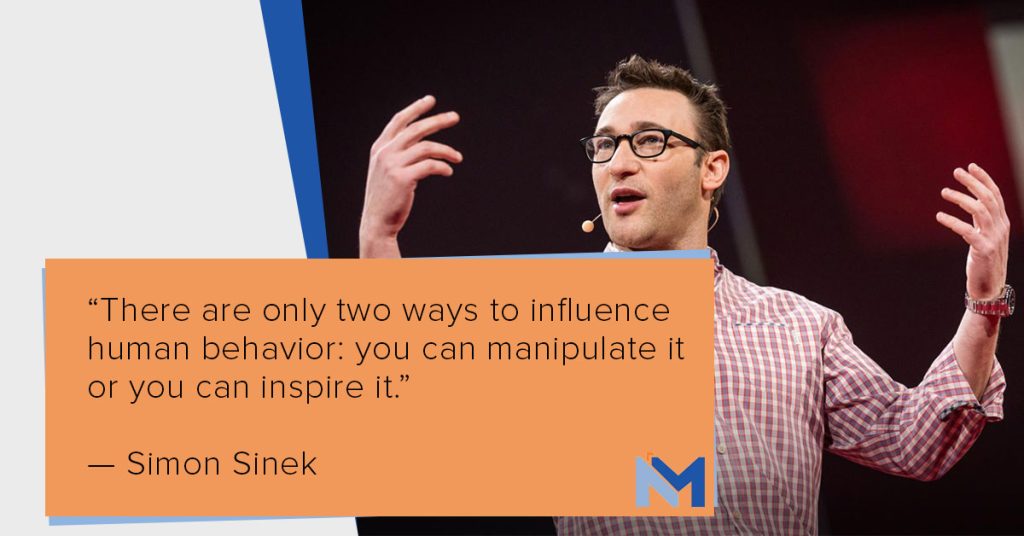
As Simon Sinek says, “People don’t buy what you sell, they buy why you sell it.”
Answering the why is about inspiring customers. It’s about showing that their values are your values. It’s about proving that you do what you do because it’s your passion and because it delivers a core satisfaction that goes beyond the superficiality of business. To answer the why you have to show why you do what you do. What are the values of your business? What propels you to wake up in the morning and help others achieve their goals and outcomes?
This isn’t something you can talk about once and call it a day. Your philosophy should reflect on everything you do, from the words on your website, to the quality of your work, all the way to the decor in your office.
For example, don’t you think that having the latest dental implant technology says something about you and your dedication to providing the best quality work in your power? Or that taking the time to understand and address the issues that people are truly facing, rather than the ones you think they are, shows a dedication to truly helping your patients? These qualities all define you and your business. Flaunt them.
Social Proof
As we have come to painfully see in today’s politics, anybody can say anything on the internet. In fact, anybody can say anything in person, too. The question, then, is: how do I prove that what I’m saying is true?
The values that you communicate in your marketing are the core component, but there’s more we can do to really drive the point and to give it unquestionable weight. We do this through the use of social proof.
When I worked at Tony Robbins, social proof tended to come in the shape of a quote or a video provided to us by one of Tony’s famous clients. If you visit his website, you’ll see what I mean on the home page. He has quotes and stories from Maria Menounos, Hugh Jackman, and Pitbull. Every email he sends has social proof and every page that’s trying to sell something has some type of element that gives third-party verification of the claims the sales pitch is making.
At the small business level, not all of us have famous clients. Luckily, social proof can come from more than just famous people. They could be customer or patient testimonials. And, in my opinion, these are often more believable and genuine than celebrity stories depending on what’s being sold.
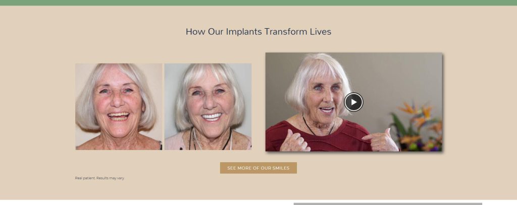
How much social proof should you include on a landing page? Enough to support the copy without distracting from that escalation toward a closing statement that will get someone to fill out the form at the bottom or call you. Depending on the length of the landing page, I use one or two testimonials, oftentimes paired with before-and-afters.
Social proof also includes the associations you’re part of, the companies you work with, and the awards you’ve won. Anything that underscores your authority in what you’re talking about, anything that signals trust from a third party, can be used as social proof.
N.B. If you use before-and-afters, remember to add a disclaimer that these are real patients and that results may vary.
Build Your Landing Page for Mobile
When I build a landing page, I have different mindsets for different screens. What you see on desktop can change if you were to look at the same landing page on mobile. Mobile is simply a different experience and the elements needed to make the conversion can differ depending on the device being used.
Regardless, if you’re optimizing for one thing, optimize for mobile. This is why:
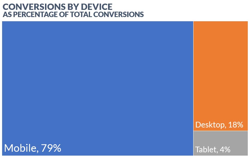
That’s 4 out of 5 patients who filled out a form or made a phone call after clicking on a Google ad on their mobile device.
Best practices include:
- Make it load quickly and efficiently.
- Short, quick paragraphs are easier to read.
- The text must be easy to read.
- Use photos and images strategically. Don’t let them dominate, use them to support the text.
- Make the page convenient. Heavy, heavy call to action that lets the person contact you exactly when they want. Don’t force them to scroll all the way down or all the way back up to get in touch with you.
- If you use video, make these short and with a punch.
The Right Way to Use Stock Imagery
Not all stock imagery is bad. I use stock images on almost every landing page. If you use the right ones, in the right way, you can visually communicate the emotions and message that will get the visitor to contact you.
The key is authenticity. There’s a lot of bad stock imagery. These tend to have people who are looking at the camera, people holding unnatural poses, or people with unnatural facial expressions. They may include elements that make people uncomfortable — such as dental tools or operatory chairs, in dentistry. Photos shot in corporate settings or otherwise obviously staged also come off as inauthentic and can drag your landing page down.

There is such a thing as a good stock photo. These tend to show people in realistic settings, with realistic poses, and authentic expressions. Typically, these photos tend to be action or lifestyle shots, showing people who are genuinely interacting with each other or otherwise engaging with their environment. They tend to strongly communicate energy and movement, and they’re interesting to look at and take in. Finally, the subject doesn’t look like he or she knows a photo is being taken.
Take, for example, the image above and compare it to the one below. The subject is smiling in both, but only the bottom photo looks genuine.

Because bad stock photography is endemic in some industries, a lot of clients prefer not to use them at all. This can unnecessarily constrain a marketing company because stock photos can provide contexts that are nearly impossible to get from photos taken by the business itself.
You’re selling a service, but you’re appealing to the opportunity’s goals, ambitions, and outcomes. These tend to transcend the product or service. They have to do with life, enjoyment, and passion. These qualities are represented by specific types of photographs, such as this one:

This is a purchased photo, proving that there is such a thing as good stock photography.
N.B. An Easy Rule of Thumb in Recognizing Authenticity in Photos
If the subject is human, there’s an easy way to tell if the person is genuinely laughing or smiling, or whether the photo is staged.
From the 1996 paper, “Physiologic Effects of the Smile,”
[T]he most studied, most replicated, best documented marker that has shown the most convergent validity across subject groups and social conditions has been the Duchenne marker.
What is this Duchenne marker?
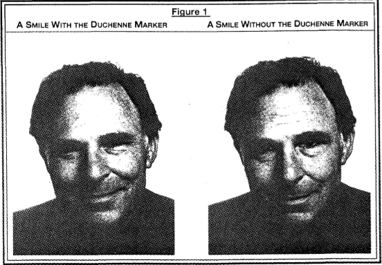
Research shows that people who smile genuinely, meaning people who are genuinely feeling happy and not just smiling to smile, will use both the muscles around their mouth and those around their eyes. Inauthentic smiles typically only involve muscles around the mouth.
Killing it Above the Fold
In his book on advertising, the great David Ogilvy of Ogilvy & Mathers said that the headline represents 80% of the opportunity to sell the audience the product or service. That is, if the first thing the audience sees is not strong enough, you will lose 80% of your chance to generate the lead.
This lesson carries forward to today.
I saved this section for last because of how important it is.
The above the fold section of a landing page is what you see without having to scroll down. It should be self-contained. It’s not an introduction, it’s an elevator pitch. It’s the only thing the majority of your visitors will see or notice. It is crucial that you hit the nail on the head.
The elements contained with the opening screen must include:
- Who you are.
- A strong headline, with a supporting subheadline, that explains what you’re selling and why they should buy it from you with absolute clarity. This is often referred to as your unique selling proposition.
- Short, bullet-pointed benefits of what you’re offering.
- Social proof.
- One clear call to action.
- A hero image — a single image that defines the section.
Because of space limitations, social proof can be as simple as an award or an associate you’re part of. Likewise, your company logo is an easy way to introduce yourself.
This above-the-fold section should look different depending on the device being used by the visitor. This is the single most important part of your landing page, it’s not worth cutting corners. Make sure that the above-the-fold section is compelling and custom-tailored for all major screen sizes.
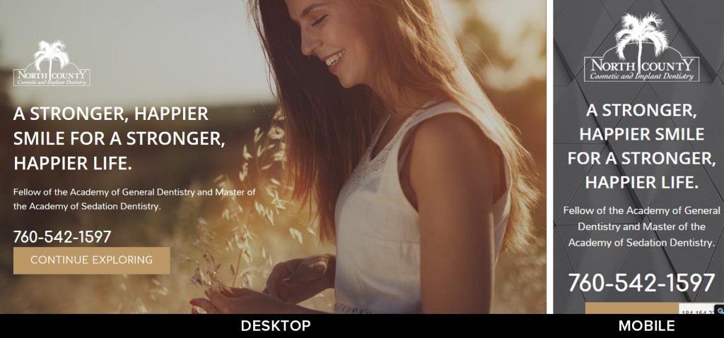
While there are certainly ways the above example can be improved, notice the differences. The text sizes are custom-tailored to the device, the image changes (text on faces is busy and hard to read), and the message is more compact. The first improvement in the above example is to make the service explicit.
This is the most important part of your landing page. Spend the time to make it look at its best no matter how your visitors are reaching it.
Final Considerations
It goes without saying that the content on the landing page should align with the content on the ad, meaning that the landing page should be relevant to the ad and it should deliver on the expectations the ad gives. If you’re selling basketballs but you send the visitor to a baseball landing page, you probably won’t sell much. Likewise, if you promise a visitor 25% off on the ad, but the landing page gives only a 10% discount, this can ruin the experience. Matching expectations sets the stage for whether the visitor feels that the ad and landing page can be trusted.
Another thing to remember is that almost everything can be tracked these days. We can track how far down a page visitors scroll, we can track what parts of the page the visitor focuses on the most, and we can even track if individual elements — like videos — are being engaged with. Using these metrics, we can improve the landing page over time in a way that is specific to the context of your visitors, your market, and what you’re selling.
Although I do strongly believe that there are common elements between all successful landing pages, don’t let this get in the way of showing your personality. People don’t buy what you sell, they buy why you sell it, and your personality, your culture, and your values play into that.