
(Image Credit: Ashley Hildebrand)
Is your website responsive? If it’s not, you’re losing patients:
- 35 percent of search traffic in the United States today originates from mobile devices, including smartphones and tablets, and this figure will continue to increase.
- Mobile internet use has surged by 67 percent over the past 12 months.
- Over time, mobile search may very well exceed desktop search — actually, worldwide, this is already true.
If your website isn’t designed to target the mobile search market, you’re missing out on up to 35 percent of the patient traffic you would have otherwise received. Worse still, your desktop-only website will attract a progressively decreasing number of patients, as users continue to ditch their desktops for mobile devices.
Google Rolls out “Mobile-Friendly” Tag
To make the message explicit, Google has recently started to label websites with a “mobile-friendly” tag. You can see this for yourself every time you conduct a Google search on your phone. This is what it looks like:
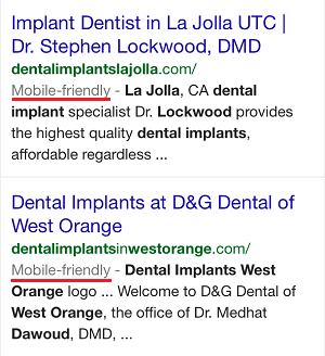
The tag offers web searchers the ability to identify which websites are more likely to work optimally on their device. If your website is non-responsive, it could very well be skipped over by a mobile user, just by virtue of not having the “mobile-friendly” label. Not only may a non-mobile-friendly site be ignored if seen, it may also not be seen at all.
While Google has already been showing different search results depending on whether the user is searching on a desktop or mobile device, the company has now made it more explicit that responsiveness will factor into how well your site ranks. Why is Google doing this? They want to guarantee their customers, or web searchers, the best possible experience. As anyone who has ever used a cellphone before should know, visiting a non-mobile website on your smartphone can be an absolutely horrendous experience. In other words, Google intends to show mobile-user-friendly websites first, because those are the websites mobile users prefer to visit.
The bottom line is, mobile-friendly websites have a competitive advantage, and this advantage will only get bigger over time. If your website is not responsive and making it responsive isn’t currently in your plans, the amount of online leads generated will dwindle and your business will suffer as a result.
What is a Responsive Website and How do I Get One?
It used to be that some businesses would need two websites, one for desktop marketing and another one for mobile marketing. This is fortunately no longer the case, because responsiveness allows us to have one website that adapts to different screen sizes. If you visit nowmediagroup.tv on your cellphone, for example, you’ll notice that the layout adapts, or responds, to the size of the screen. It makes it easy for you to access the information you need no matter what you’re using to browse. Your website should do the same; if it currently doesn’t, it’s time for an upgrade.
At Now Media Group, we specialize in developing and executing comprehensive marketing campaigns and we expect to cater to patients across a wide variety of devices. We want to connect you to your patients, which is why all of our dental infosites and websites are responsive. No matter if a patient uses a desktop, a laptop, a 5” mobile screen, an 8” mobile screen, or a tablet, that patient will be able to find your website and will be able to navigate through it in a way that is optimized to the device being used. If you’re tired of losing potential patients because of an out-of-date website, contact us through our site, https://nowmediagroup.tv/, or call us at 858-240-4544 today.