 Ashley Hildebrand is Graphic Designer at Red Door Interactive. She has worked with clients such as ASICS, Shae Homes, Rubios, and Vokey. Ashley has extensive experience with website design, an example being Now Media Group’s own website, and logo design.
She won two Bronze Addy Awards in 2013, for Sweet Tomatoes & Soutplantion’s “12 Days of Menu Faves,” and 2014, for “ASICS New York City Marathon.” You can see some of her work on her portfolio.
Q. You have extensive experience with web design and branding. What’s your general impression of these aspects with specific regards to the dental and medical fields?
While I’ve come across some great dental sites, there are a lot of outdated websites and logos out there. Dental and medical professionals should look to rebrand or redesign their website at least every five years. For websites, it’s even better to update them yearly with new imagery, to provide something fresh for their patients. It’s also worth it to keep your patient testimonials up to date.
Q. Why do you think it’s worth it to rebrand or redesign a website every five years?
It’s important to do that because your logo and website is the first thing a new patient sees about you. They’re judging you based on what these look like; your logo and site give off a particular vibe — they say something about your practice. You want your patients to have a good first impression. If you have a really nice website, you are interpreted as being more reputable and with a higher quality of services. It also shows a higher attention to detail, which is important, especially if you’re a dentist or plastic surgeon.
Q. What are some things dentists and other medical professionals should avoid when designing a logo or a website?
Using Clipart! [Ashley laughs.] Also, using posed stock photography. You want people to look natural. If it looks candid, if people look like they’re enjoying their day-to-day lives, it looks better.
Also, I recommend not using the colors red or yellow. They’re bright and they don’t go well with other colors. Instead, use cool, calm colors, because these appeal more to people. Cooler color also insinuate trust, and that’s definitely something all dentists want to communicate with their patients. Some examples are blue, green, and teal.
Another thing to avoid is excessive amount of text on home pages. By this I mean large chunks of text. No one is really going to read it, instead they’re going to skim over it, and you want to have small, digestible pieces of copy, with icons or imagery that communicate what you’re talking about. Simple is always better, so try to keep things clean and simple.
Q. To what degree is this “clean and simple” philosophy a product of contemporary taste? In other words, is minimalism more of a trend or is it something that’s timeless?
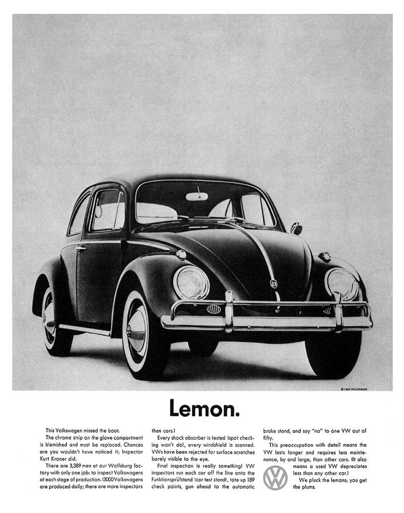
Well, it really is timeless. Consider print ads before websites. For example, Volkswagen, back in the 1960s, had a small image of the car with simple text. There was a lot of whitespace, which helps put the product into focus — front and center —, with supporting copy and text. You don’t need a lot of fluff. It helps make the main message clear right away, and people are more likely to read the copy, because there’s less clutter to distract them.

Q. Do you think minimalism also helps with the conversion process? You mention that it keeps the main message clear. Does this have an advantage when it comes to sending the patient down the right path, as far as a practice’s marketing is concerned?
Yea, absolutely. Minimalism generally leads to well thought-out user experience. User experience involves planning how a web page should look based on user interactions with that page and its functions. Minimalism makes it easy for a patient to scan the page and see the appropriate call-to-actions, by allowing these call-to-actions to stand out. You can direct the patient towards the end you ultimately want them to go towards, which is to schedule an appointment with you.
Q. Let’s talk logos. A lot of dental logos include imagery related to the profession — a tooth, a smile, et cetera. What’s your opinion on this?
If they use these kind of cliché images in a new and interesting way then it’s fine. Otherwise, I would avoid them at all costs.
Q. What do you recommend instead?
I recommend trying to make something more unique. Try a logo that fits your personality or your practice’s values. Another direction to go is to make the logo abstract, or to opt for an all-text logo. But, like with a website, you want it to be done stylistically, versus, for example, plain simple text written out.
Q. You also have a lot of experience with designing social media shareables. Can you explain what these are and offer dentists some advice for their social media strategy?
Shareable images are designed to engage with patients, or people more generally, on social media platforms. They help promote brand recognition and engagement. They’re also a good way to crowdsource — they can result in testimonials and they can provide information on your patients that can help you better market to them.
A simple rule of thumb is to post three times a week. I also recommend that you comment and engage with other peoples’ posts, so you appear more genuine and personable. You also want to engage with your own patients, so don’t be afraid to join the conversation if they reply to your own posts.
Remember, people don’t always want to see stock photography or even designed items. What I mean by this is that your followers will appreciate photos of your office and of community outreach. You want to especially avoid overly “salesy” imagery.
Q. Thank you for speaking with us today and for offering us some truly great insight. Do you have any last words of advice?
My last piece of advice would be [when selecting a logo design] to just go with your first instinct. 9 out of 10 times, clients end up going back to the one they first said they liked. It will save you time and money. Also, for all your different creative projects, whether that be a website, identity package (logo, stationatry, business cards, pamphlets, brochures, etc..), just remember that LESS IS MORE.
![]()
Have a question? Ask Ashley in the comments below!
